Responsive Web Design
Tesla Solar Energy
Project Overview
To improve the user experience of choosing between solar products,
the redesigned responsive landing page
• Uses a grid system.
• Helps the user to make a decision while increasing the click- through rate to the ‘order page’.
• Target Users : People who looking for solar products (Ususally over 55years old people are big solar purchasers)
About
Responsive Web Design
Landing Page Redesign
Role
UX/UI Designer
Individual Projuect
Duration
6 Weeks
Problem Statement
- We need fewer steps to access the main functions.
- To improve the user experience, adding a customizable part should be implemented.
- Since a few of the main features are hidden, I can improve the use of primary functions that users had not used before.
Target Users
People who looking for solar products
Usually over 55years old people are big solar purchasers
Result
-What’s success?
- Navigation bar available on all pages.
- On both mobile and tablet pages, users can consult with experts through 1:1 chat and order products.
- Instead of “Order Now” on the main page, a CTA button called “Save Your Money” is inserted to easily access the page where they can see how economically beneficial they are when using the product without any burden.
1. Grid System
2. Navigation Elements
• Desktop (1920X1080)
• Tablet (1024X768)
• Mobile (375X812)
If the user does not know the page order, it is necessary to click the mouse one by one to know which bar is moving to which page.
Problems If user wants to touch the bar on the tablet, they have to touch it very carefully. Otherwise, there is a case where the finger touches two bars at the same time.
Effects This helps users move to the desired page more comfortably.
• Why they need responsive web?
According to research (marketingcharts.com), 3 out of 5 tablet owners ages 50 and older use their tablets daily and over 55 years of age are big solar purchasers,
So, we can say target user for Tesla Solar Products could be ages 50 or older people. They are more friendly with e phrase ‘Save Energy’ encourages the users to click the CTA button at the first page more often than ‘Order Now’.
• Why Desktop First?
This is not social media, streaming service or useage of user’s freetime. User might visit this website when they have exact purpose to consider wheather buy this products or not.
3. Desktop
Current web design
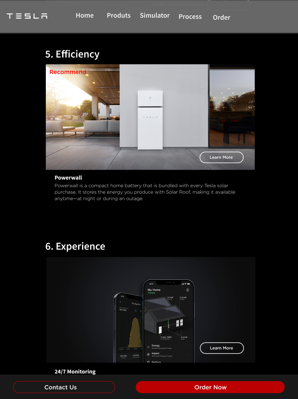
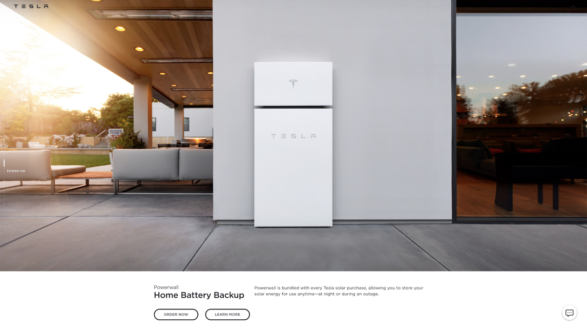
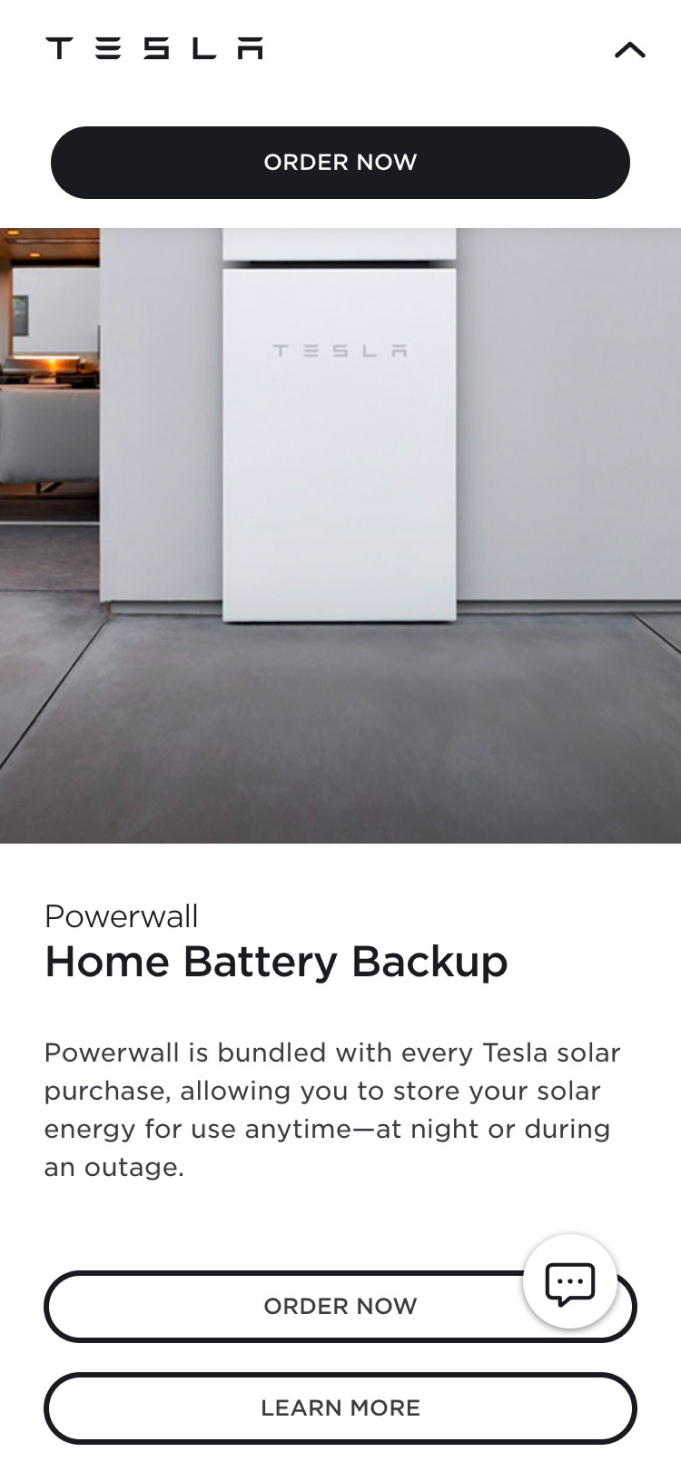
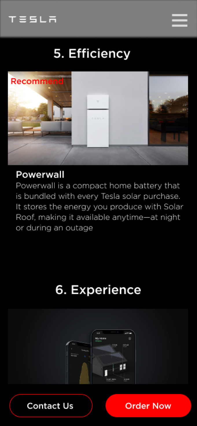
Because the solar inverter and the powerwall are explained on different pages without the clarity on their needs to be together, the users are confused about what they need to buy.
Redesigned website
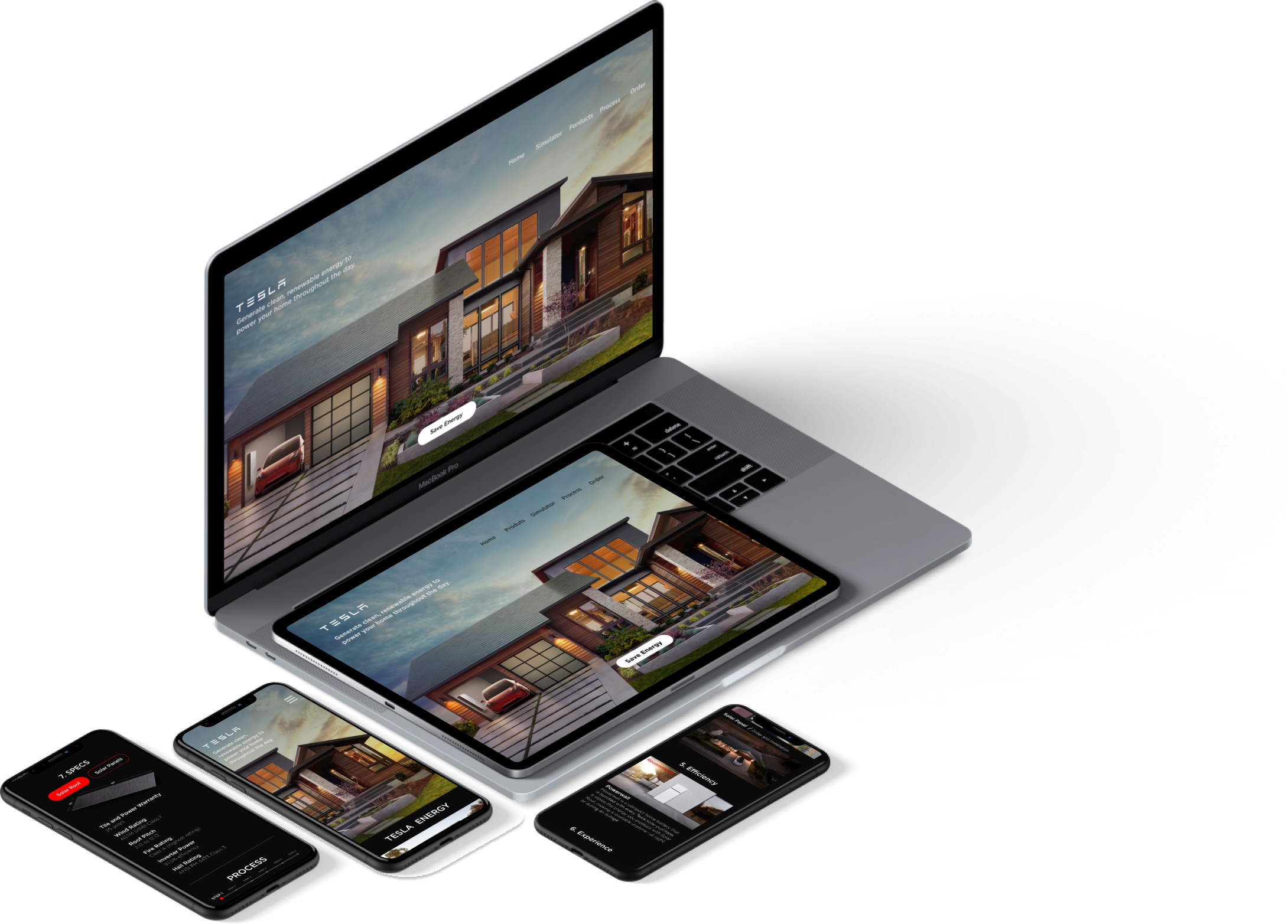
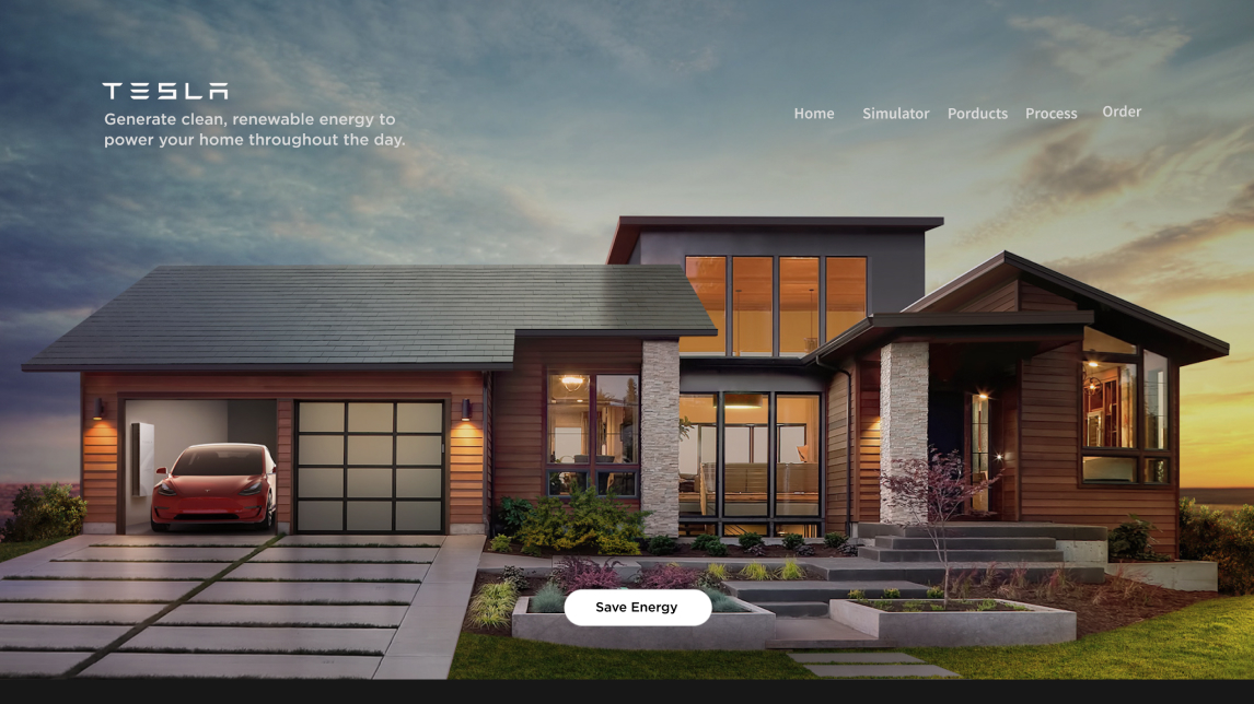
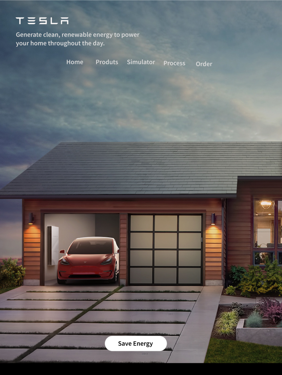
The phrase ‘Save Energy’ encourages the users to click the CTA button at the first page more often than ‘Order Now’.
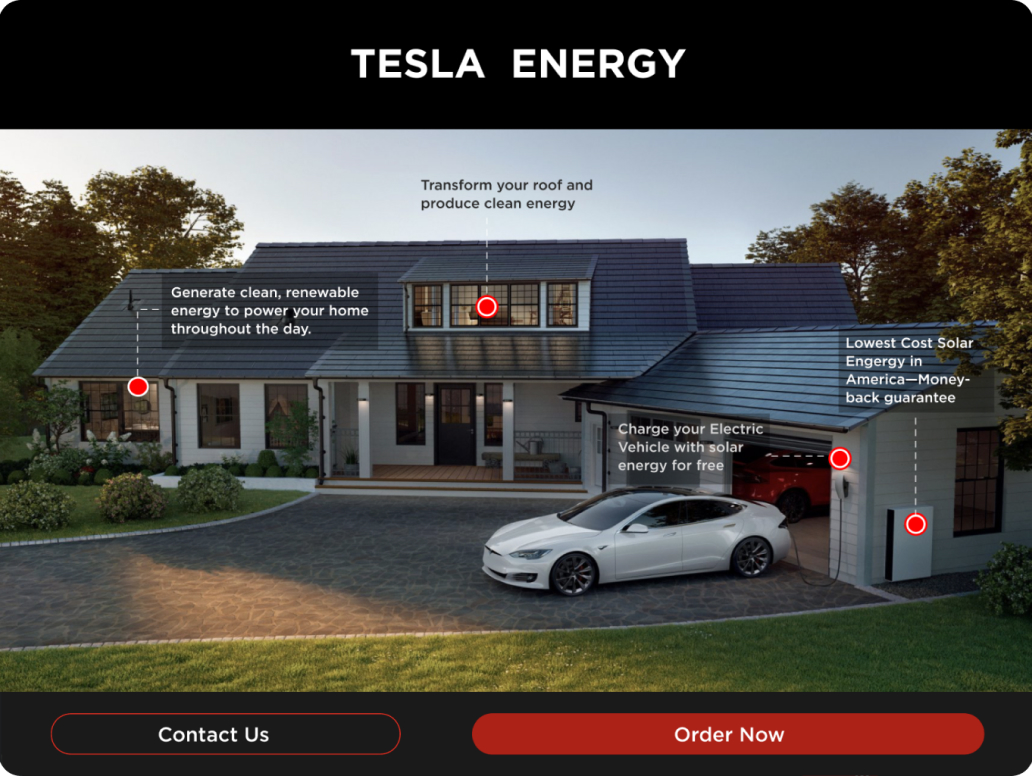
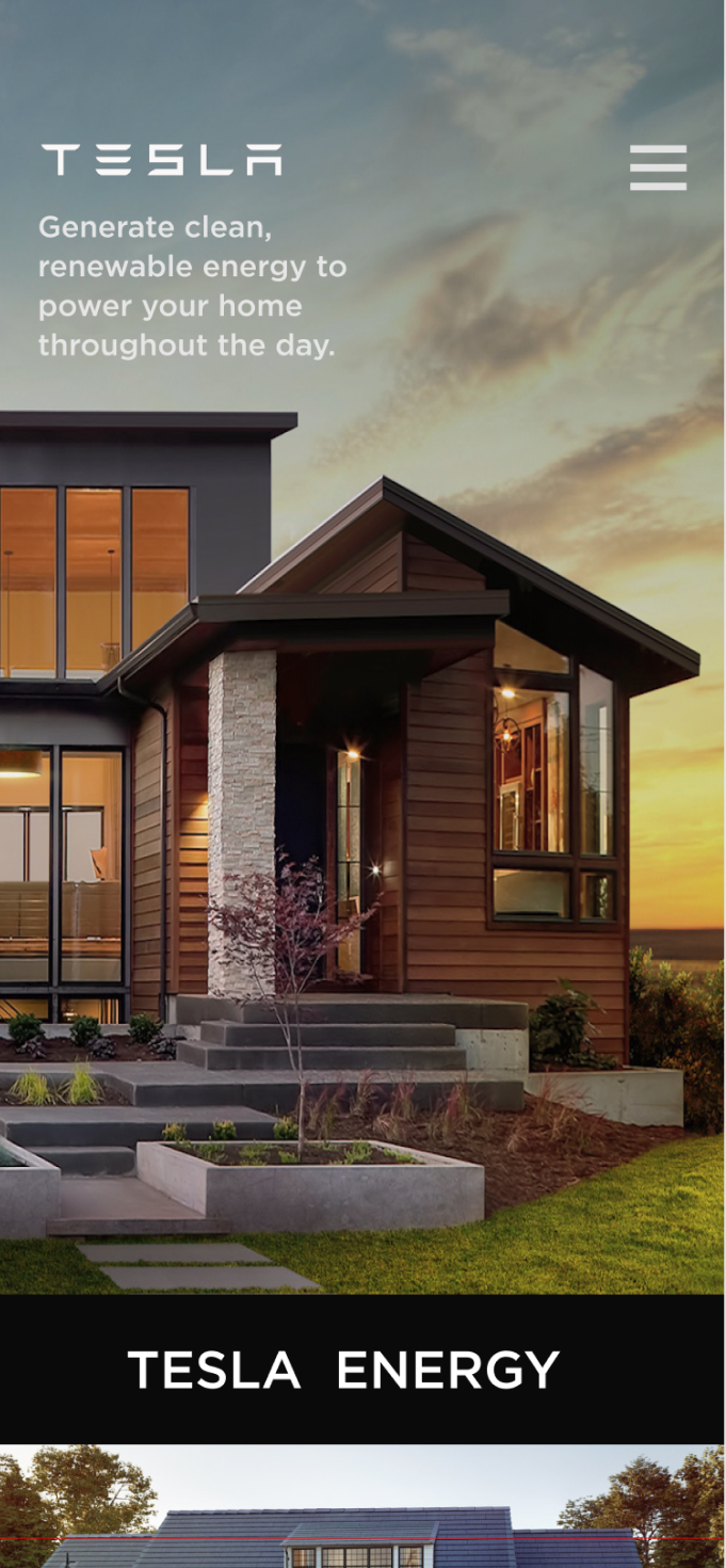
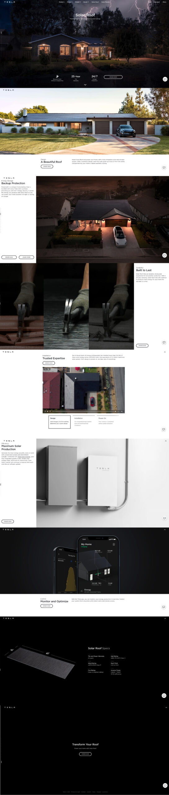
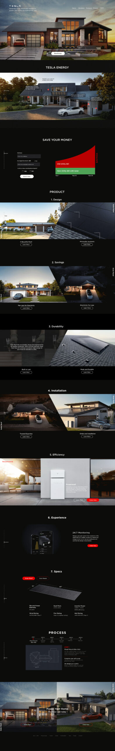
Customer education of Tesla Solar Energy’s advatages empowers the users.
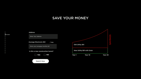
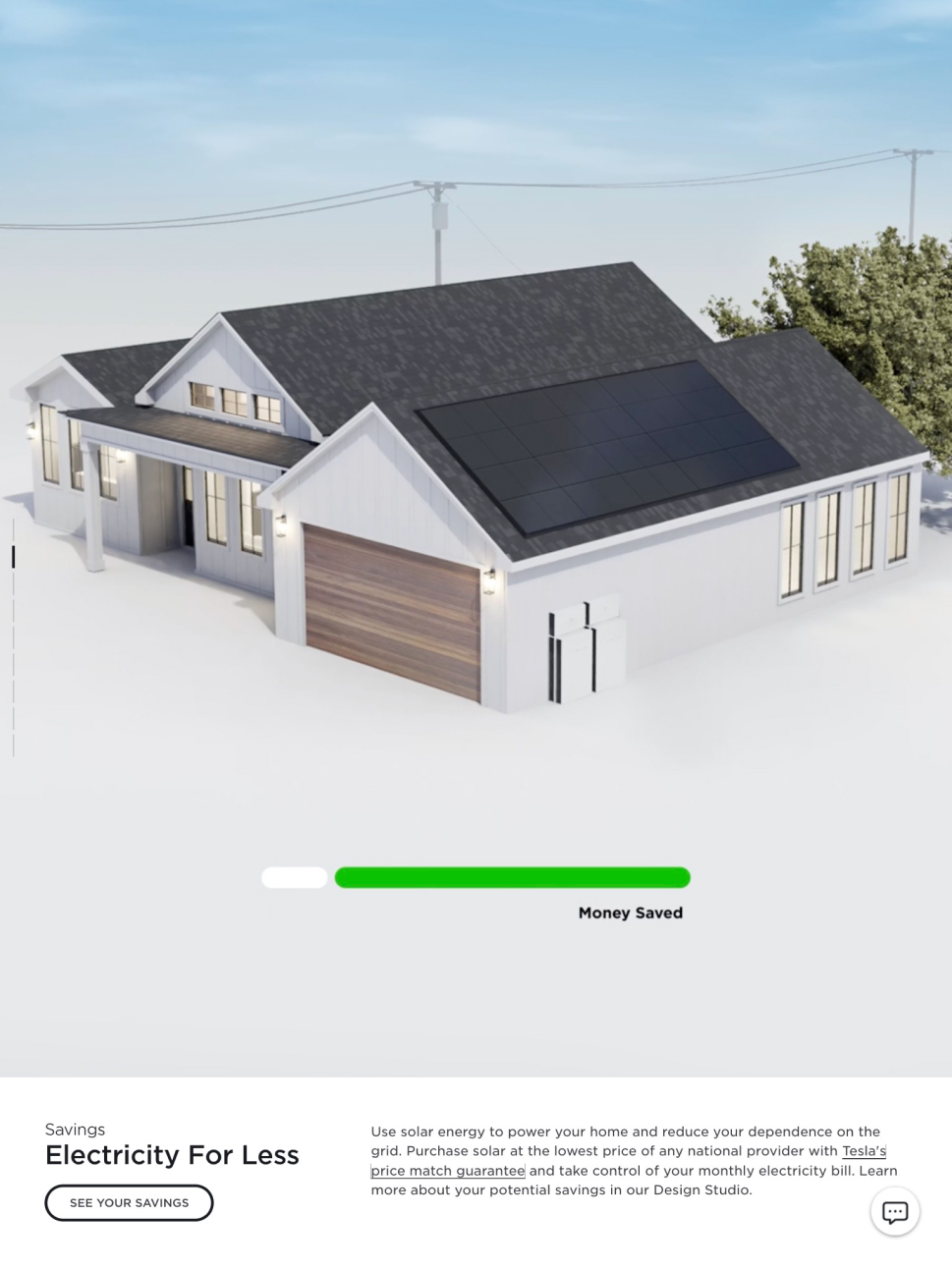
The Saving Simulator helps the users learn their savings with each products.
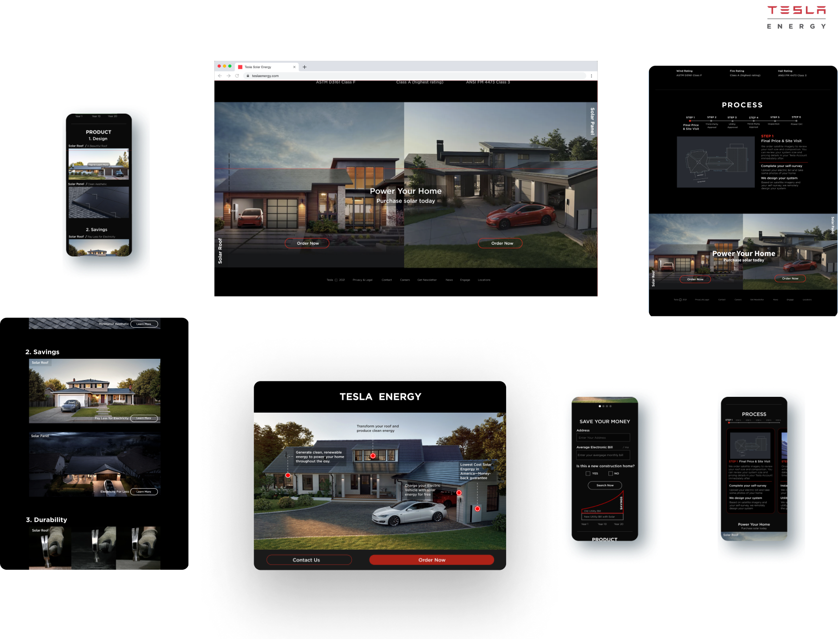
Users can easily compare solar products by categories.
Users can easily hover over an image to learn more, reducing confusion.
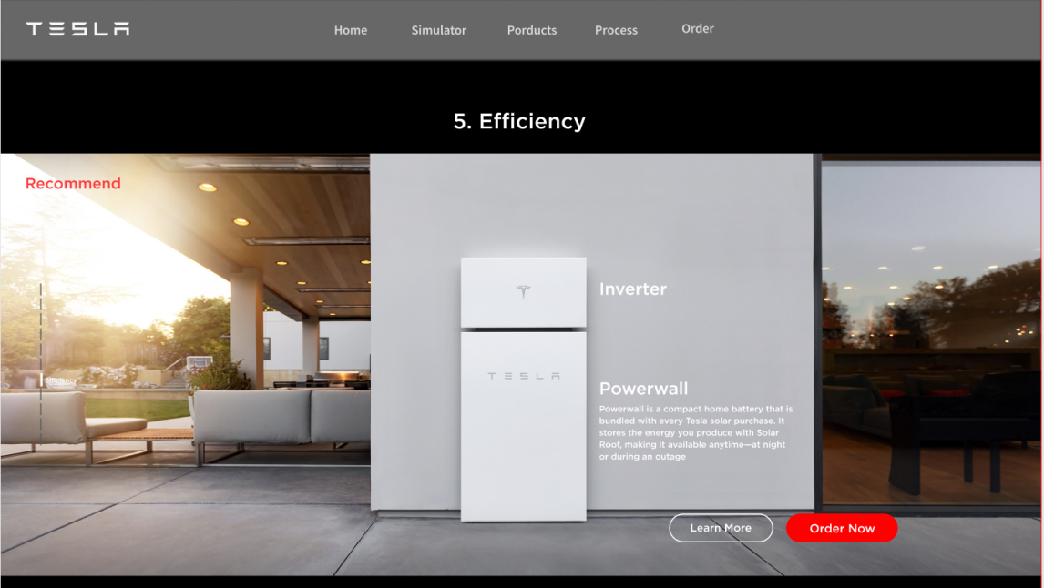
Users know exactly how the solar inverter and the powerwall interact with the solar products, helping their decision-making process
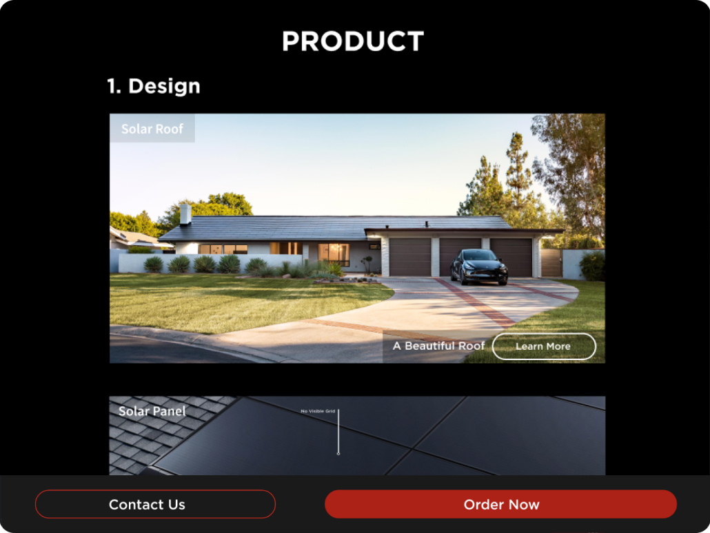
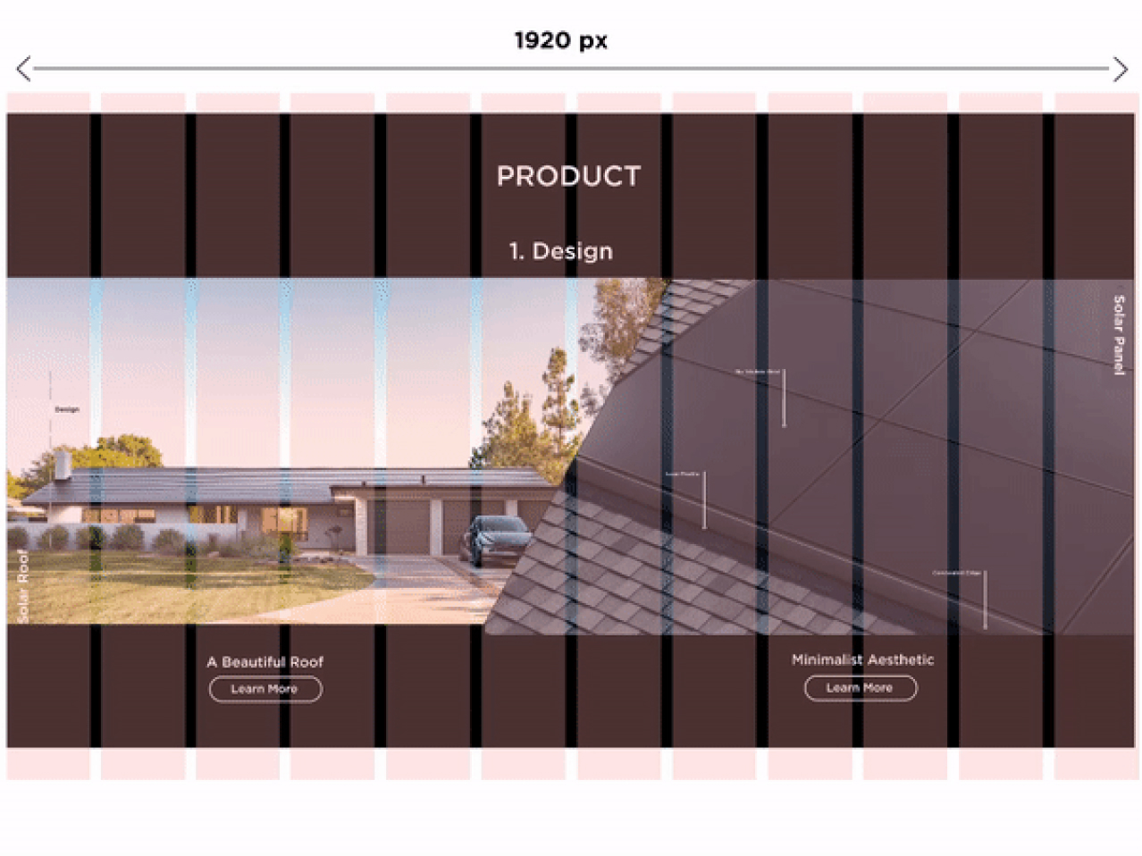
Users can compare the details between the solar roof and the solar panel for better decision-making.
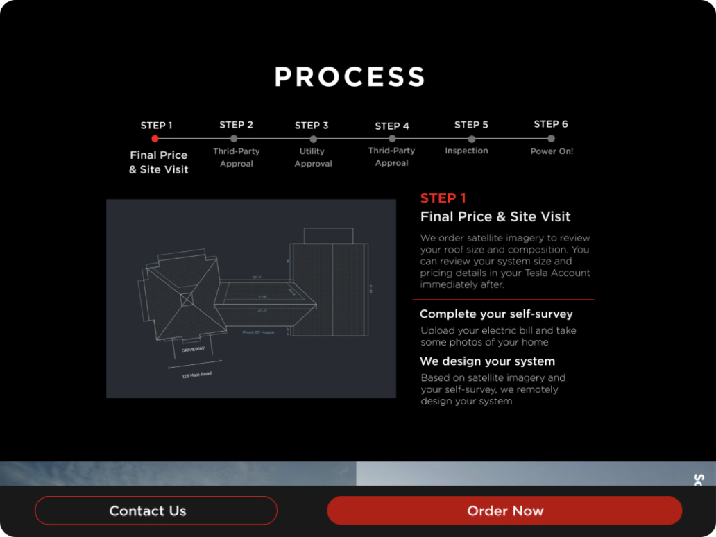
Users can see the whole process from the purchase to powering on, learning each steps in between.
4. Tablet
5. Experience
On boarding experience
If they access the simulator to create positive images of products, it will reveal how the products can be used in their homes.
Order Experience
“Save Your Energy” brings users to the simulator that seamlessly trasitions over to the order page where the users will see the advantages of the solar products and come to appreciate the low cost of getting started.
6. Key Features
7. What I’ve learned
To make a great user-centered design, I realized that it is essential to understand certain issues (such as business objectives and users’ needs) and the nature of the desired service before conducting user research. I analyze the contents of the user interviews to discern the most important goals of the project.
My process is to analyze, design, and do a usability test or an A/B test. It is vital to listen to what the users prefer and why they prefer it as discovered in the usability or the a/b test, and then analyze it again. In the case of a particular project, this process has the most significant impact on my results.