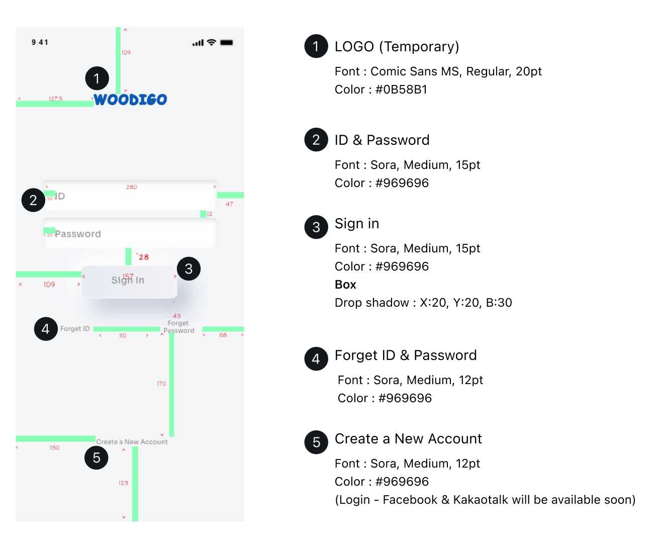
Woodigo is messaging app sharing location and place they been to.
Design based on service panning and target user’s needs keep discussing with team members to enhance user experience form end to end flow.
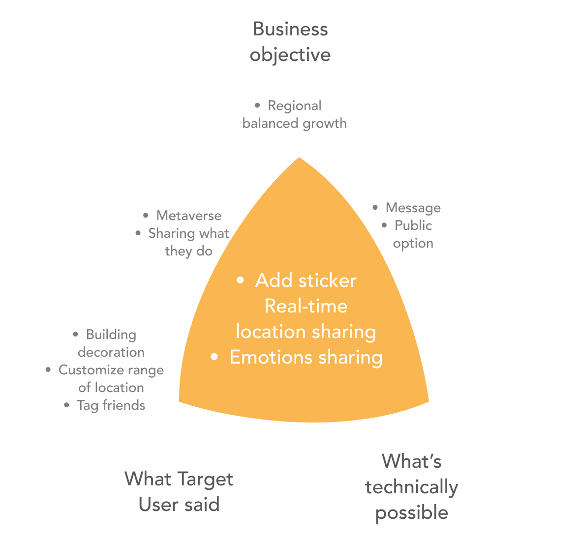
Business Objects
Metaverse
Real-time location sharing
Forming an emotional network online
Target Users
Korean Gen Z
Result
94% of users identified the purpose of using the app and enjoyed it.
-What’s success?
Intuitive UI Interesting micro interactions Design considering the user flow
– What’s not success?
Users need more interesting features to continue using this app.
About
Product ThinkingConcet Development Interaction Design Prototyping
Role
UX/UI Designer Product Thinking Concet Development Interaction Design Prototyping
Duration
11 Months
Key Features
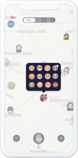
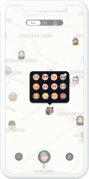
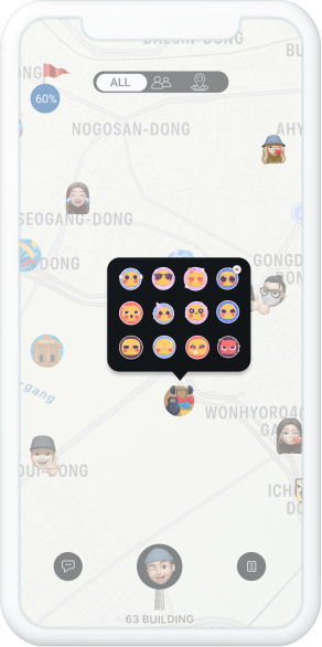
Add Stickers
It is the most fun element for users to interact with each other.
As soon as users enter the home screen, they can see icons of new posts posted by their friends, and stickers can be attached there.
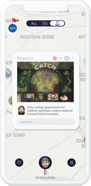
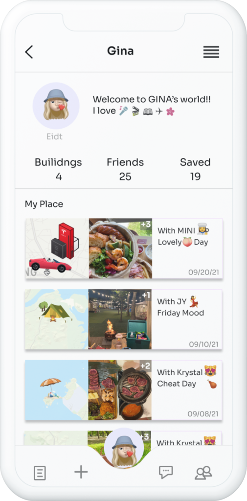
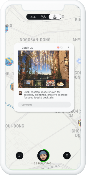
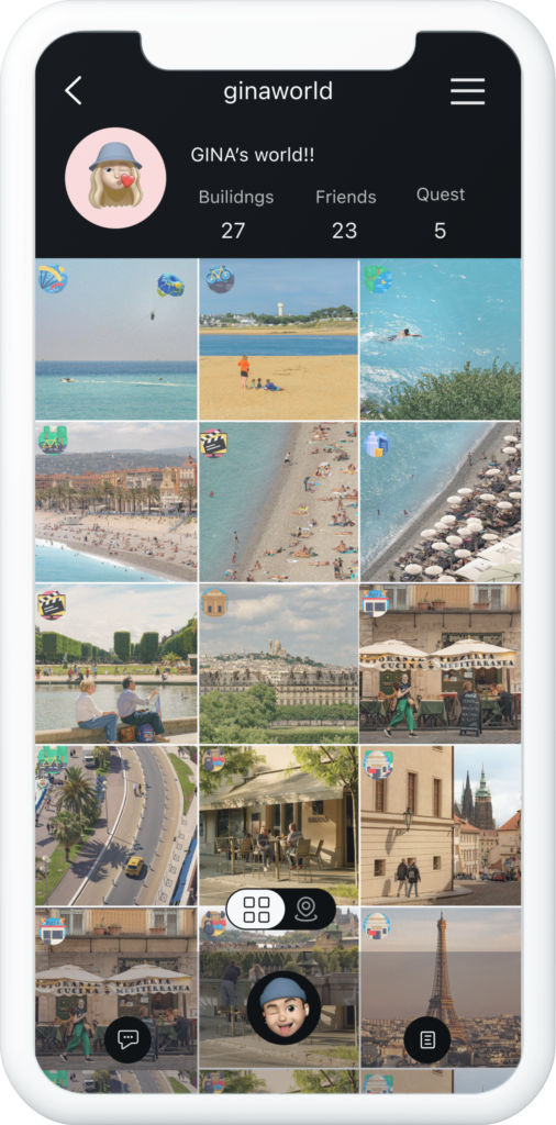
Posting Preview
Users can see photos and explanations in the posts when they click the icon of a new post posted by their friends and comment there.
Users can easily see what the new posting is without going to the feed.
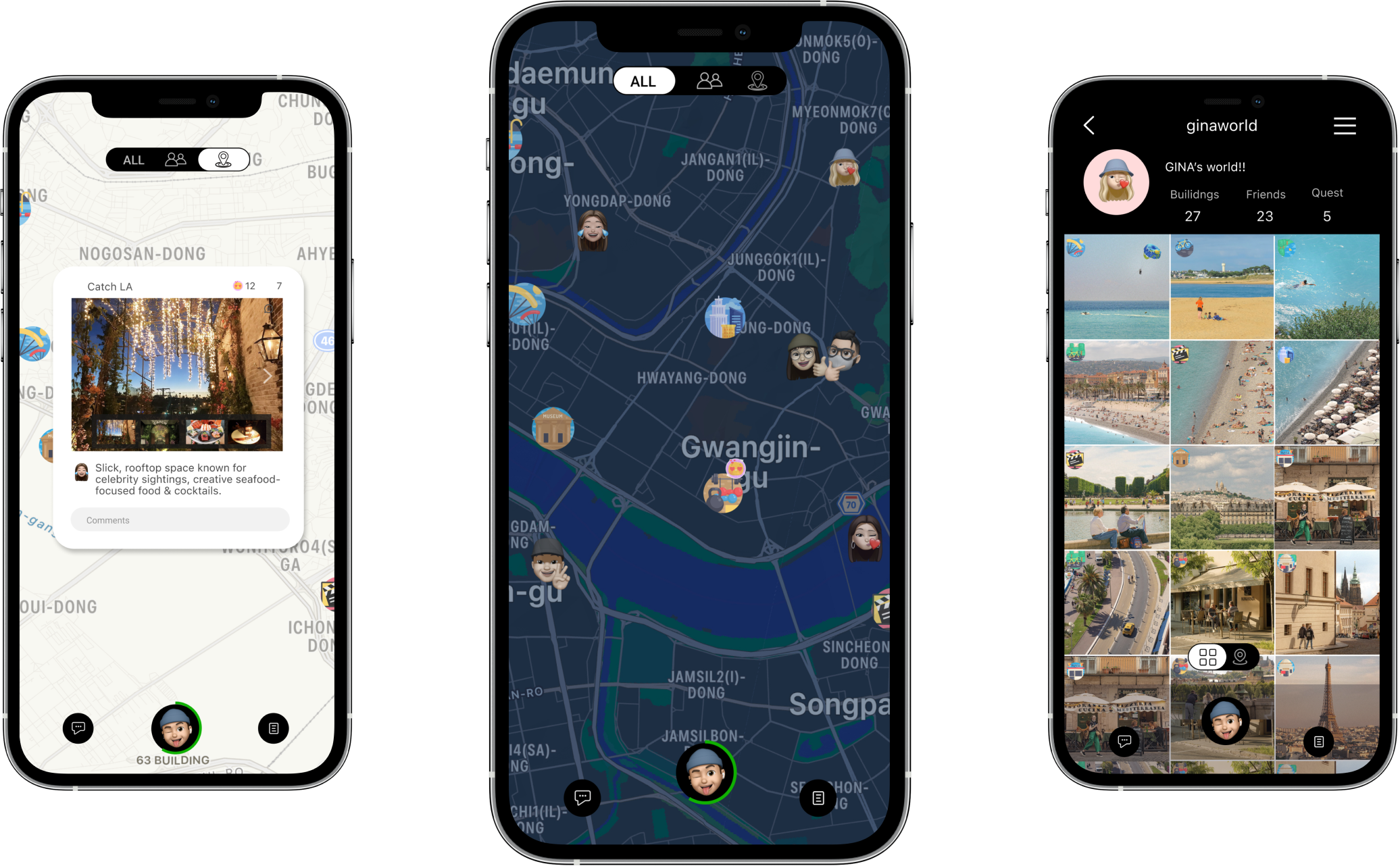
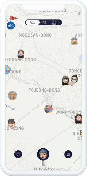
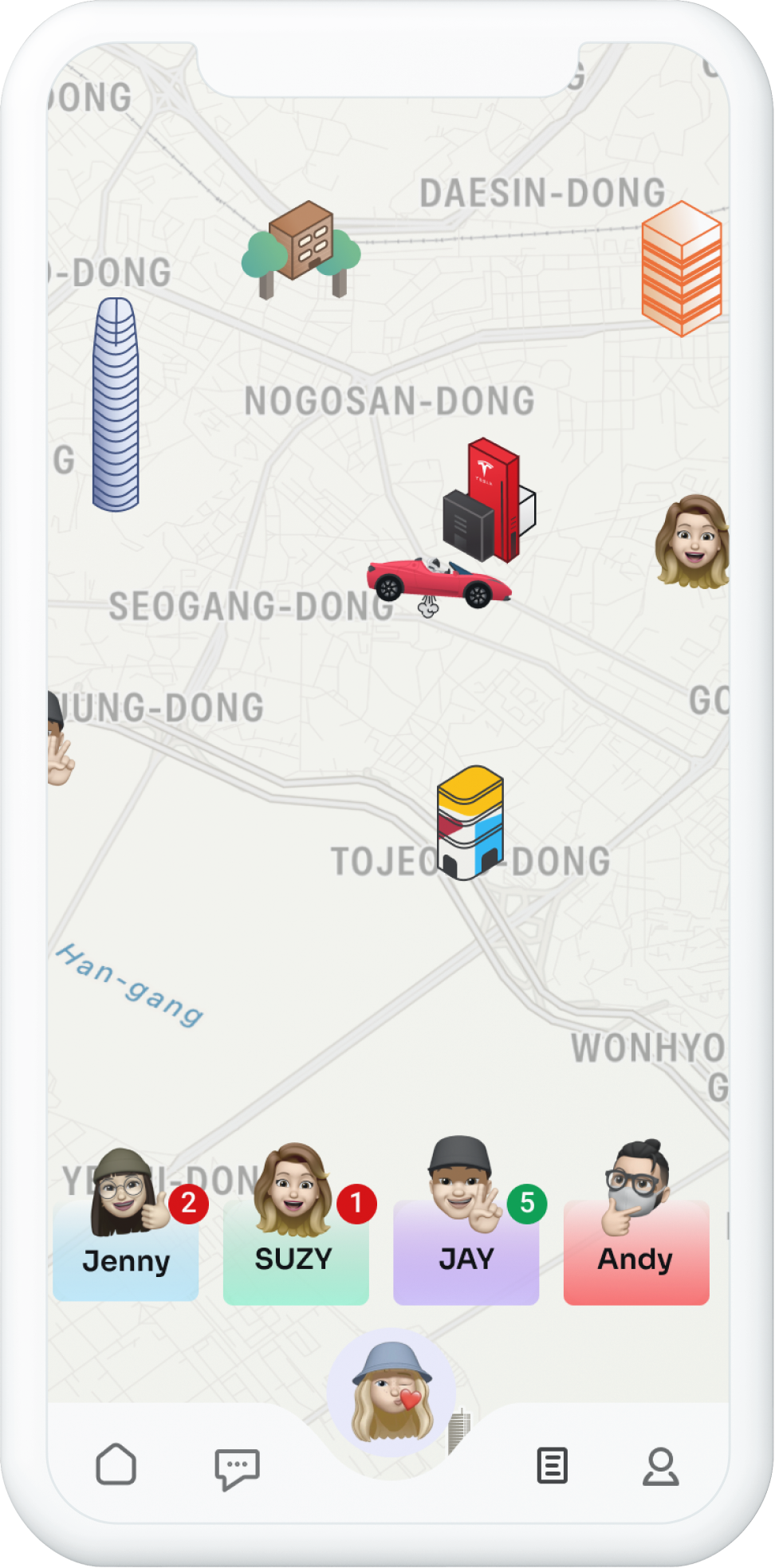
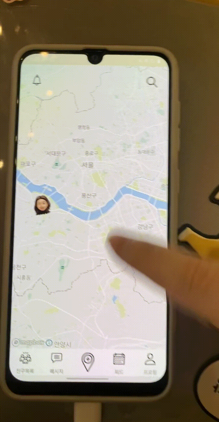
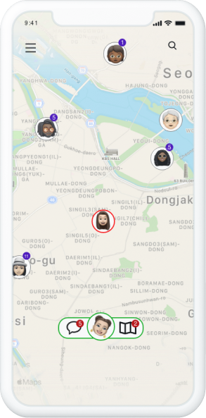
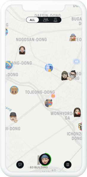
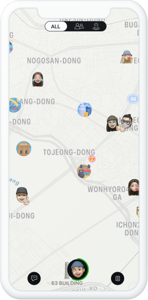
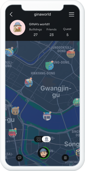
Map - 3options
It is designed to view information with three options on the map on the home screen of this app, giving users the choice to view only the information they want.
Users can use the app without complications by using different tabs, each of the two most representative functions of the app on a small mobile screen.
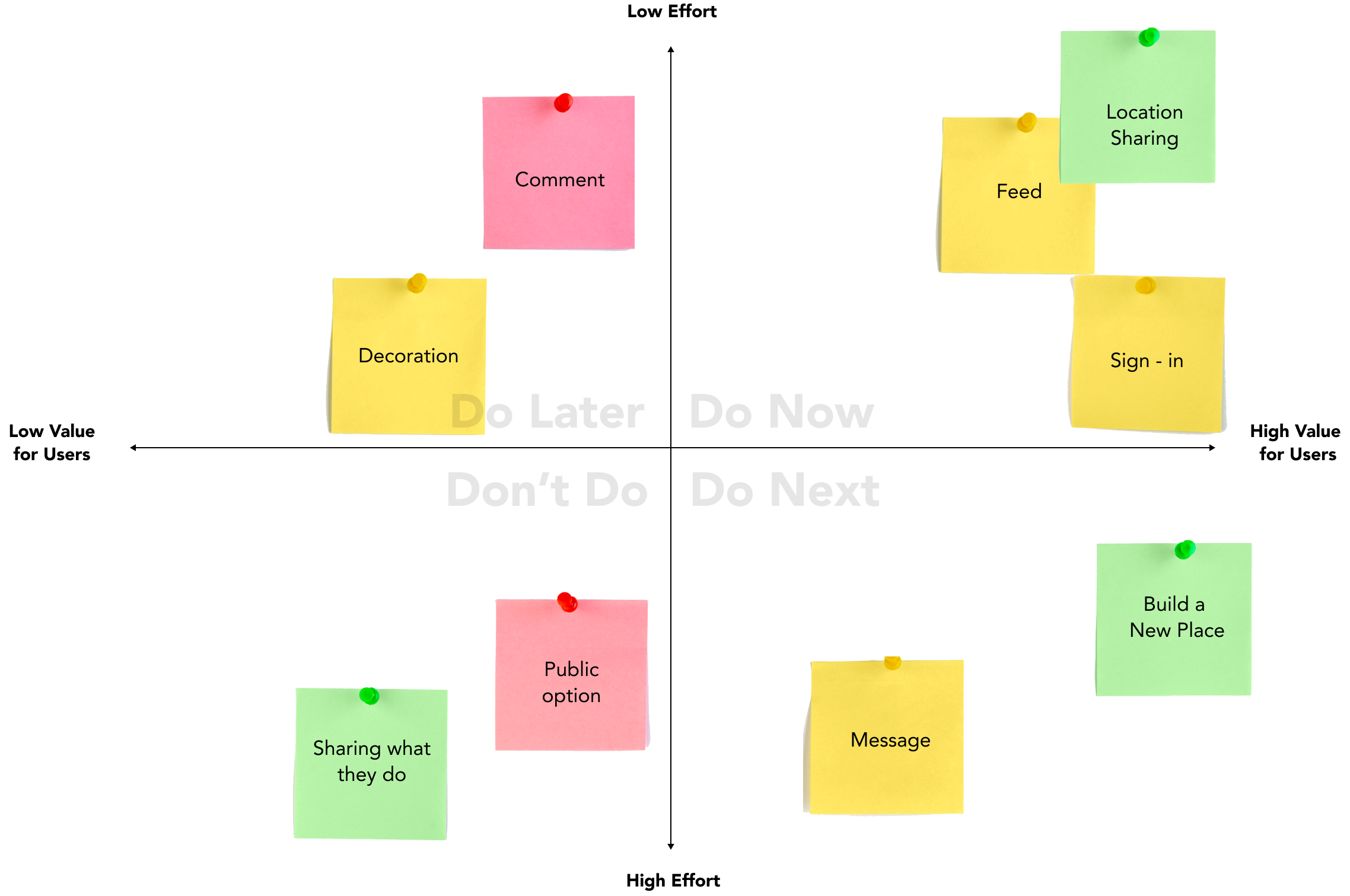
Challenge
Bridging Business Plan to Design
• Venn Diagram
• 2X2 Matrix
• Prototyping
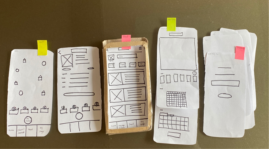
We scetched our app based on planning. While creating a wireframe, I talked about numerous options with developers and planners, identified the flow and purpose of this service, and entered Alpha Design.
Version ALPHA
Main
My Feed
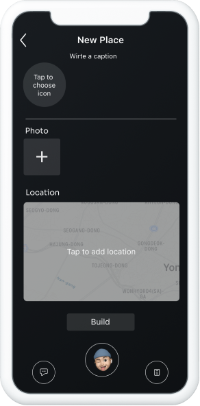
Add New Place
Our design is based on a business object and a survey of 25 people from Generation X. When designing the alpha version, and the essential parts were decorating their own map and sharing real-time locations with friends through GPS. These two parts were the most important to be designed, and alpha tests were conducted.
Test : To see feasibility
Version ALPHA - Feed back
Were you able to understand and use icons and functions without explanation?
The function and UIUX parts has to be modified based on the results derived from the survey conducted after the alpha test.
UIUX Part
Clarify your app’s hierarchy
Design the process of adding new places to the map naturally and elegantly
Business Planning part
Adding elements that require users to visit your app regularly
Consult with the technical department to find out how to add new places on the map
Technical Part
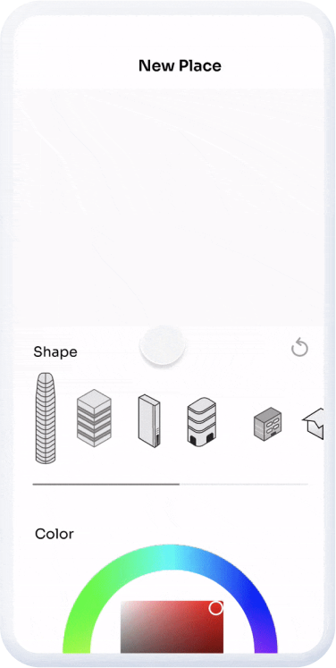
Finding ways to build 3D buildings on the map
When erecting a building, realizing the function of stacking images of floors, roofs, windows, etc. one by one
Implementation of function and style for changing the color of each image when erecting a building
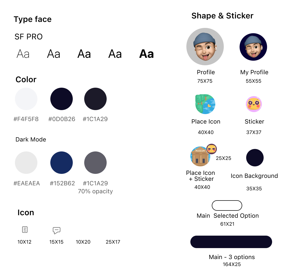
Design Guideline
• Design
• Style
Design
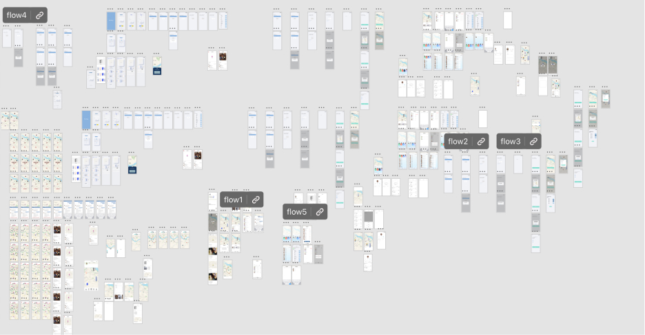
Developed process
Initial Version
Version Alpha
Version Beta
Version Beta (Dark Mode)
Features
On Boarding
It is designed to be simple and receive all the necessary information so that users can feel the onboarding stage easily and simply.
Add Sticker
This is the part where users can participate the most in this app. Users can respond by attaching stickers to new posts posted by their friends.
Post Preview
Without going to the feed page, you can see simple information by clicking on the new places posted by your friends on the main map.
Add New Place
Users can post new posts with a few touches. By simplifying the process of adding new posts, users are encouraged to post frequently.
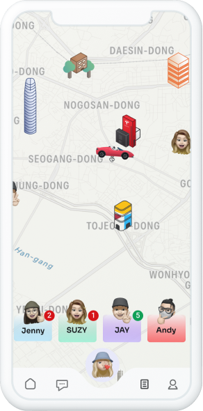
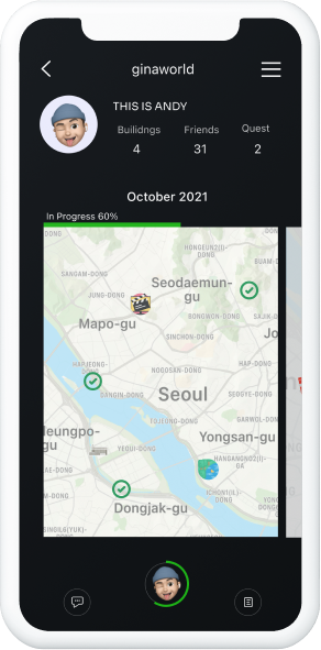
Main Map – 3 Options
There are 3 ways to view the main map. You can view your friends’ places and the places your friends have recently posted, or you can view them individually. This helps to avoid the inconvenience of detailed information on a tiny phone screen.
Quest Challenge
It’s a special element that keeps users coming and going to use this app. It is an element that collects the places the user has saved and visits 5 places to break the quest.
Feed – 2 Options
Due to this app is place-based nature, the user can see the places posted by the user on the map, and a list option is given to view them in a timeline.
Due to development problems, beta tests have not yet been conducted. The usability test conducted instead of the beta test was able to achieve better results than the alpha version.
Version BETA -Reflection
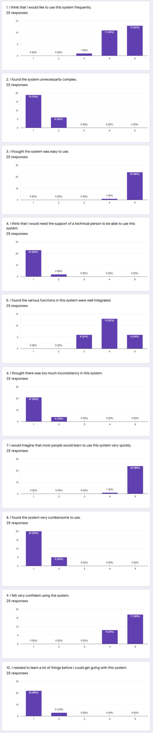
SUS Survey (Google Froms)
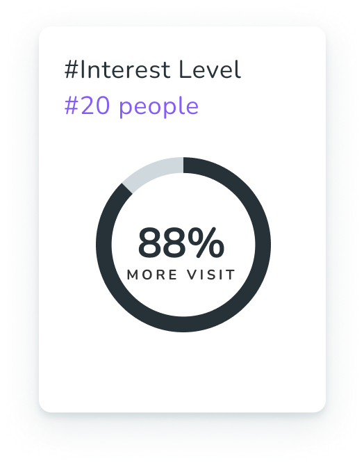
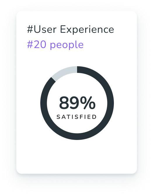
Without having to explain this app to users, they were able to immediately catch what features could be used. User satisfaction then increased from 41% to 89%. Users were more interested in this app than in the alpha test.
1. I think that I would like to use this system frequently.
2. I found the system unnecessarily complex.
3. I thought the system was easy to use.
4. I think that I would need the support of a technical person to be able to use this system.
5. I found the various functions in this system were well integrated.
6. I thought there was too much inconsistency in this system.
7. I would imagine that most people would learn to use this system very quickly.
8. I found the system very cumbersome to use.
9. I felt very confident using the system.
10. I needed to learn a lot of things before I could get going with this system.
Impact & Reflection
It’s not an app that has already been developed; it’s designed from scratch. It was an opportunity to show how to communicate and work with project managers and developers by participating in the entire process from setting up the company’s concept to developing, modifying, and designing. And I was able to develop my thinking and creativity to cover things that were not implemented as apps due to technical limitations, and as an ux designer, I learned and felt a lot.
Perhaps because this was the first time I had designed and implemented it as a real app, only about 70% of the designs were implemented as real apps. When discussing it with developers and planners for the first time, what they thought should be implemented was delayed due to technical, cost, and time limitations such that our plans were disrupted. Because such technical problems need to be supplemented, we should have designed with the possibility of more open options than other app designs.